
Project: Le Ann Durfey, LCSW
𖡼.𖤣𖥧𖡼.𖤣𖥧
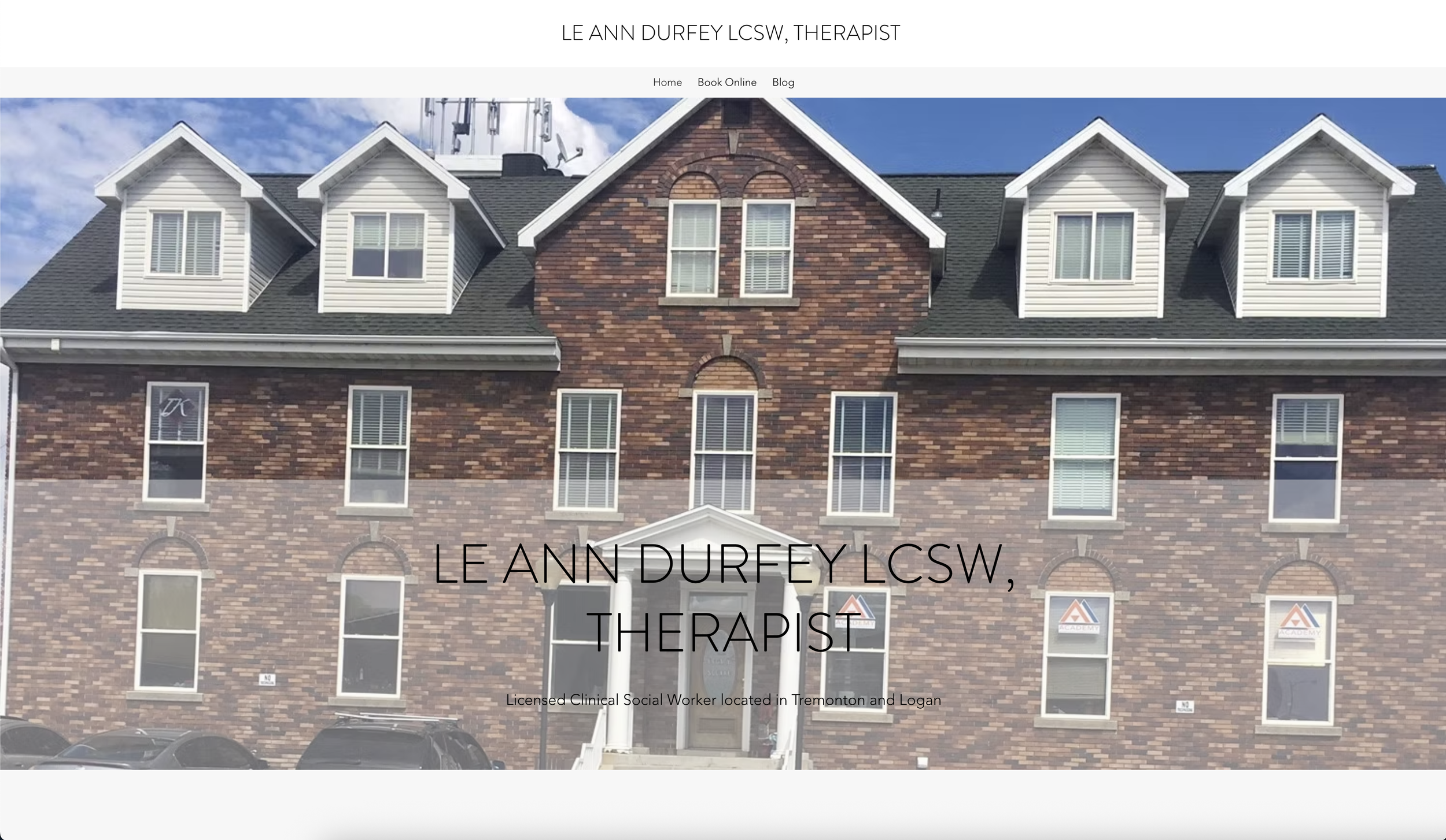
When Le Ann first came to me, she only had a domain that wasn’t even connected to a website anymore — and no real vision for what her website should look like.
What she did know: she loved pinks and greens, and she wanted her new site built on Wix.


Since pink + green isn’t a palette you often see in professional therapy websites,
₊⊹ I was instantly Stoked ₊⊹
to lean into it and create something unique.


I designed a calming but modern brand style, weaving in tasteful animations and abstract details:
ᝰ Reactive buttons + subtle hover effects
ᝰ Gentle scroll & mouse-based animations
ᝰ Abstract floral patterns that add a touch of playfulness
𖡼 .𖤣 𖥧 𖡼 . 𖤣𖥧
𖡼 .𖤣 𖥧 𖡼 . 𖤣𖥧
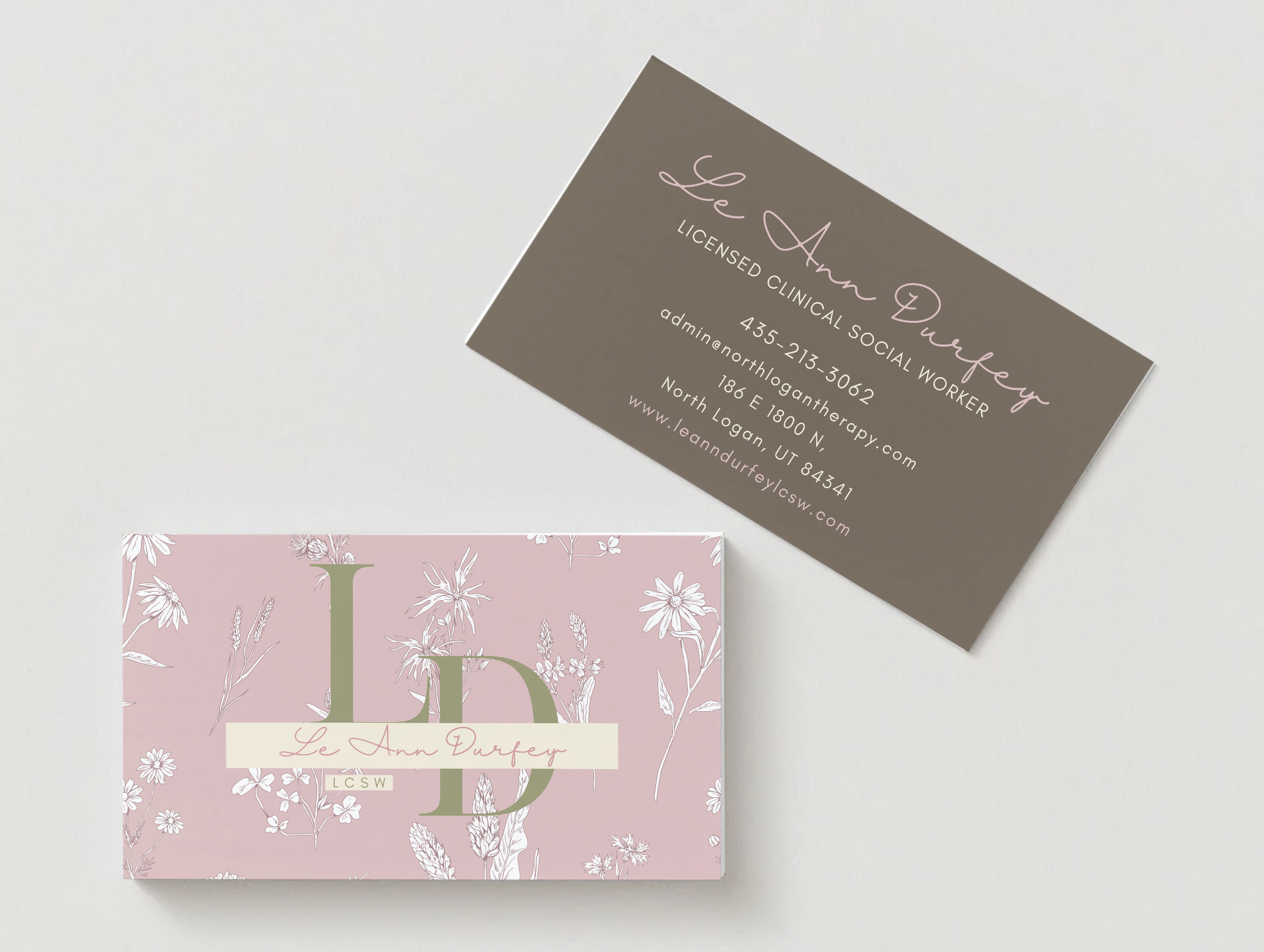
To carry that identity through, I also designed new business cards for both Le Ann and her associate, Cami
— featuring the floral pattern from their site and Le Ann’s new logo (designed by me). The result is a fully cohesive brand that feels warm, grounded, and inviting.
With florals, greenery, and cozy imagery, the site captures the feeling of settling into a comfortable chair —
safe, approachable, and welcoming.
Old vs. New
┗━━━━━༻❁༺━━━━━┛
