project: Logan River Counseling
𓆝
𓆟
𓆞
𓆝
𓆟
𓆝 𓆟 𓆞 𓆝 𓆟

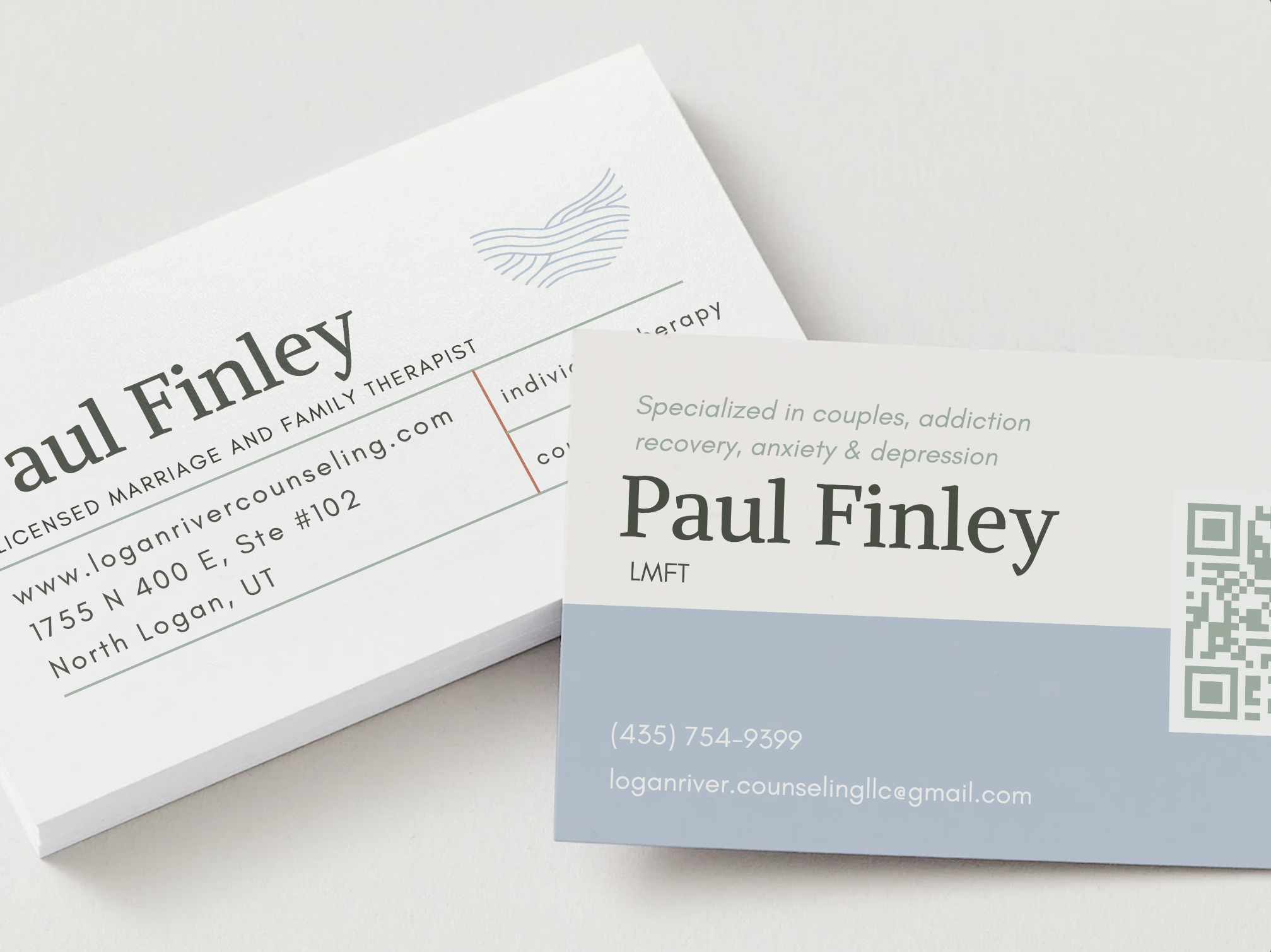
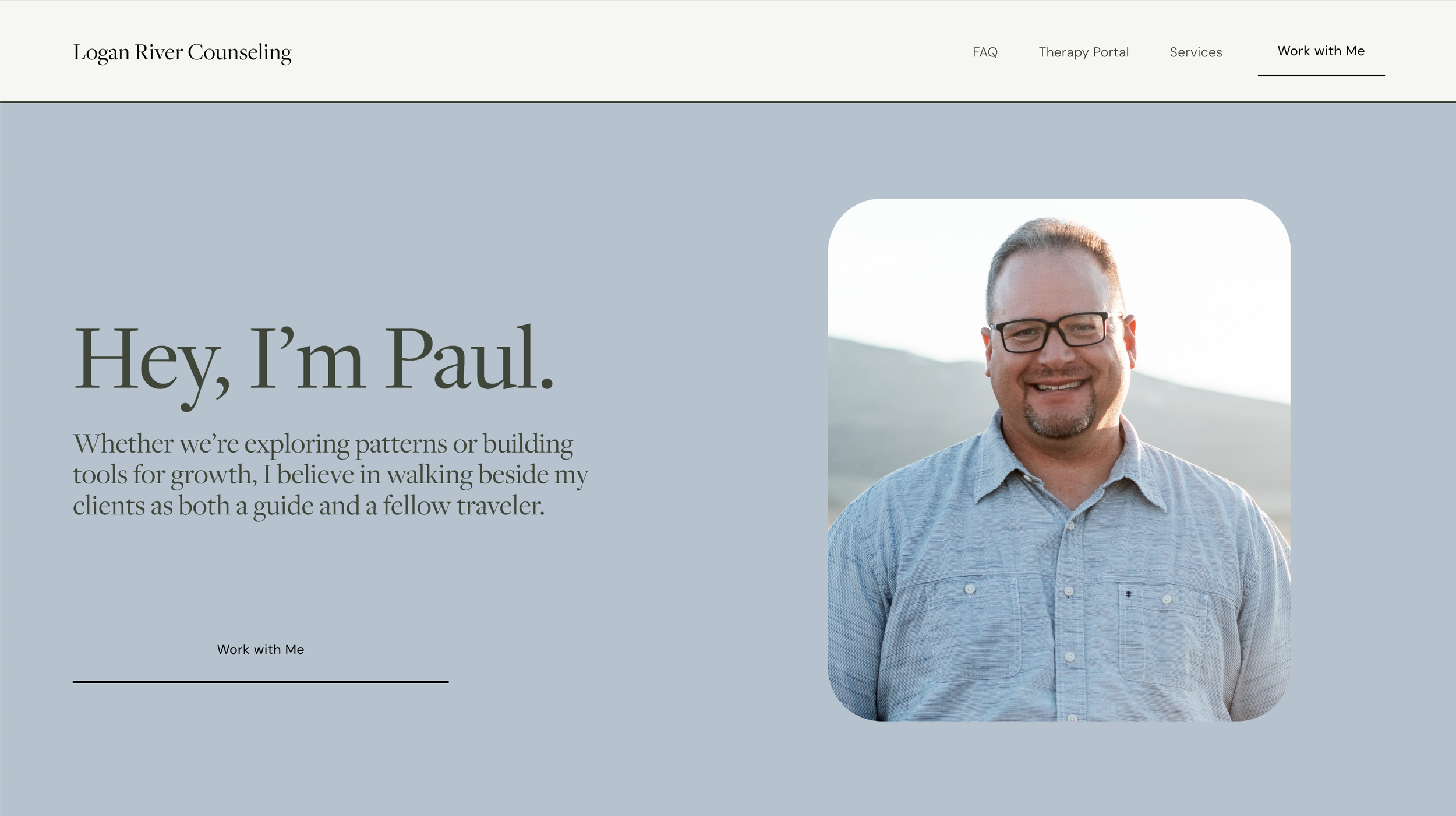
Paul wanted a brand that felt masculine and grounded, but still warm and approachable. Something that reflected both his personality and his work as a Licensed Marriage and Family Therapist.
He came to me with a clear palette in mind: blue and green, with a pop of color. After showing me his old business cards, complete with autumn trees and rich, earthy tones— I pulled inspiration from fall foliage to create a color story that felt both professional and personal.
Alongside the custom website, I designed three business card options that paired with the new branding. Paul picked his favorite (not my favorite, but we’re working through that in therapy 💅).
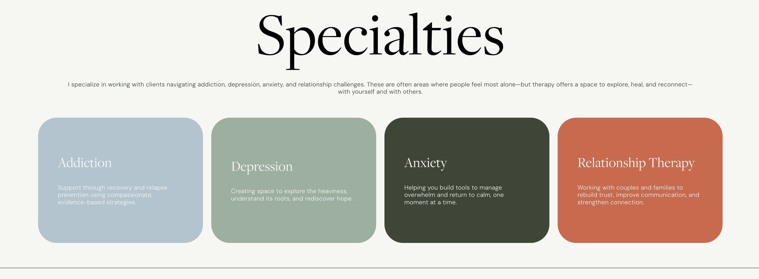
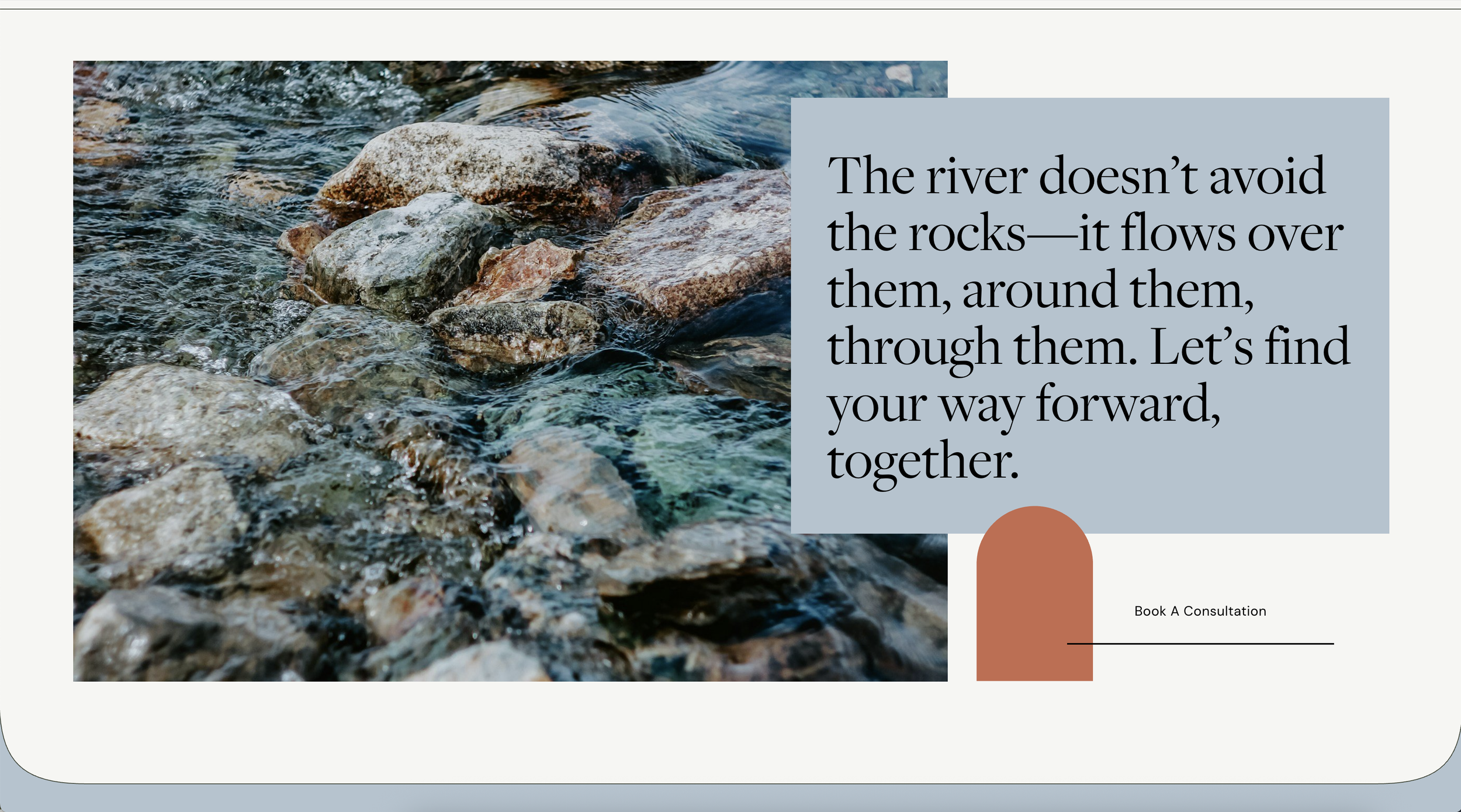
This project is a great example of finding the balance between strong and soft—
creating a visual identity that feels trustworthy, grounded, and totally true to the person behind it.


(he chose this one)
Dive into Paul’s site →